Web Development: Theta Nu Xi Gap Anchor Chapter
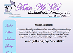
This is a website that I redesigned for the GAP Anchor Chapter of Theta Nu Xi. The first image is the original site design. It contained all the basic information in a simplistic layout. The font for the links was too narrow and difficult to read. They needed a design that was clean, professional, and better represented the organization's symbols and color theme.
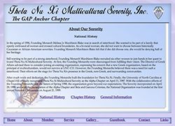
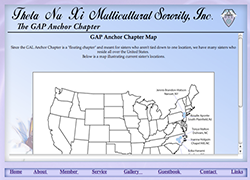
The next two images are of the new site design. It blends lavender and Carolina blue within the layout, which are the sorority's official colors. It also includes the national seal in the header, a monarch butterfly (the official symbol) in the content background, and the new name changed from Gap-at-Large to Gap Anchor. Here's a link to the video introduction of the site.
Theta Nu Xi National Royalty Media Group M. Cliver Portfolio
 Pacius Designs

