Web Development: M. Cliver Portfolio
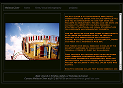
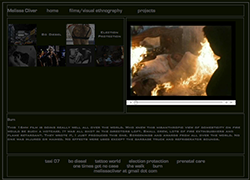
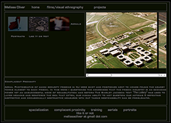
I created the website design above. The artist I worked with wanted to use a color scheme of dark gray, black and orange. A light gray color for some of the font was used instead of the dark gray for easier reading. The second image is the video/film page. The video depicted is entitled burn. The video linked thumbnails are in the left container and footer. When clicked on, the video appears in the right container as well as a description in the bottom container.
Theta Nu Xi National Royalty Media Group Theta Nu Xi Gap Anchor
 Pacius Designs

